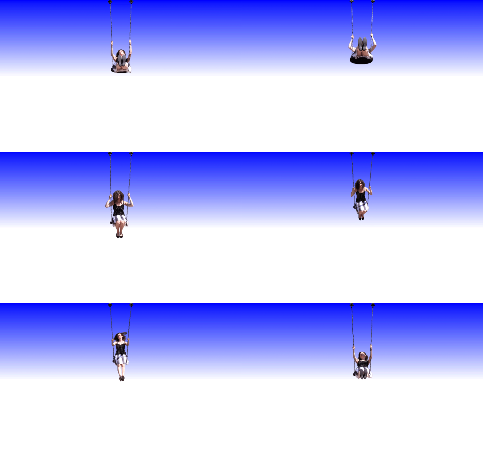
Responding to Olia Lialina’s Turing Complete User.

Summer by Olia Lialina
Q: What do you think is Lialina’s opinion of the word “user”?
A: I think Lialina believes the term “user” has been given a bad reputation since the emergence of technology and the consideration of the relationship between human and computer. She describes how the dominant culture of designing UI and UX has grown to think that users are too busy to have full agency over the things they create, say, or consume. She asserts that this perspective on the human/computer relationship looks over the potential for a truly engaged experience for the user. Rather than hiding all the “unnecessary” components of a program or website, she believes that users should be treated with respect when they engage with our digitized world. The fact that we are completely surrounded by and often heavily reliant on different technologies, general purpose computers (and Stupid Networks) are a major necessity in allowing users to get involved with the way they engage with the world. Instead of being told how they should communicate, arrange, or enjoy what’s on their screen, Lialina wants users to have more of a say in what kind of an internet or what kinds of applications they want to be using.
Q: What is Lialina’s ideal internet user? Provide some of the qualities that she outlines.
A: Lialina’s ideal internet user is one that is involved, engaged, and aware. She upholds that users should be able to “achieve their goals regardless of the primary purpose of an application or device”. She wants users to be constantly making conscious decisions as they use their technology, rather than being guided by big companies that presume what you may or may not want. One of her examples for how users can be imbued with a sense of true agency is a project called “Google Maps + Google Video + Mashup — Claude Lelouch’s Rendezvous”. It requires the user to be actively problem-solving to engage with the animated map and embedded video, rather that autoplaying both sequences to be perfectly synced up. Rather, the inner-workings of the mechanics of the experience are exposed to the user, allowing them to manipulate journey to their liking. These types of experiences allows “the user [to be] visible to themselves” and makes them feel present in the technology that they use instead of a completely separate entity that is passively using it as a tool. This ideal user should be able to make choices and have their intelligence be acknowledged by those who programmed these devices and applications. They should be treated as Turing complete users—complex, smart, and unique.
Q: From your own experiences interacting on the web—what is an example where there are “gaps that can be filled by users”?
A: I think one of most prominent places where there are “gaps that can be filled by users” is Tumblr! Even the though the actual posting and interaction systems are restricted and controlled the same way that most social media website are, the ability to completely customize the look of your theme (on desktop) is extremely rare. Tumblr actually provides users a page with the syntax and structure needed to make your own custom theme and there’s an entire circle of users that have blogs and resources dedicated to providing their own custom-made themes (it’s where I had my introduction to using HTML and CSS!) It also strikes a great balance between connectivity and privacy where there still exists a platform that allows you to follow, reblog, and message other users, but allows for a level of anonymity that doesn’t exist on most other platforms: there’s no public follower count, you can decide of you’d like to share your likes or user you follow, and there’s no need to include any name, number, or email that’s searchable. This gives users a huge amount of freedom in making their blog something for themselves—many users post their own art and music, share stories, and simply shitpost to their hearts’ content!